Tell Copilot what kind of chart you want, and it will try to create it for you.
Create a line chart for the last year of revenue
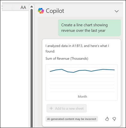
Copilot can't create every kind of chart that Excel supports yet, but it does support more than a dozen different kinds of charts now with more on the way.
Take your prompts to the next level
The more details you give it about what you want, the better the results you'll get.
Create a chart from this table that has vendor budget on the x axis and headcount on the y axis.
You can also specify details about the chart configuration. For example:
Use 10,000 as the baseline, create a line chart showing change over time. Show data labels and gridlines.
Another option is to tell Copilot what your goal is and let it create the chart.
Show a chart comparing Position in Range to diversity statistics such as generation, ethnicity, and gender.